RUSSIAN ICONS: SPIRITUAL AND MATERIAL ASPECTSVERA BEAVER-BRICKEN ESPINOLA
3 THE MATERIAL ICONThe physical creation of an icon is steeped in tradition: “Every small item in an icon has meaning and every line has a reason for being” (Ovchinnikov 1980). 3.1 THE PANELLime, pine, spruce, and larch are the woods most commonly used in the construction of old
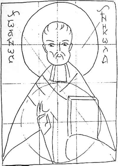
When the panels were completely seasoned and carved, the front was scored for the application of the linen and gesso. Gesso was made of a finely ground chalk or gypsum mixed with a glue. 3.2 THE GOLD LAYERNormally, gold leaf was used for the background of an icon. Gold projects light and is equated with the light of God. Gold with a greenish tone (mixed with silver) is seen on very early icons of the 11th-century. On later icons, the gold was more often a bright yellow with a slightly reddish tint (the addition of copper). A pale gold, almost electrum, provided a light background with a silvery sheen. In the beginning of the sixteenth century, Russian icon painters used thin sheets of silver with a thinner layer of gold beaten into it, so that one side became silver while the other was a very pale, whitish-looking gold. After the eighteenth century silver leaf was sometimes covered with a reddish shellac to produce a tint that looked like gold. When the overlying linoxyn darkened, it was difficult to clean without exposing the silver. Many such icons were severely damaged by restorers unaware of the delicate technique. 3.3 PAINTING THE ICONThe drawing of an icon was said to be measured in thirds (Ovchinnikov 1980)(fig. 2). An outline of the subject was often made with charcoal mixed with egg yolk.
Some artists used paper tracings by making their own or using podlinniki, which were books containing a collection of patterns intended as guides for icon painters. The practice of tracing was associated with the Stoglav Council of When the background was of metallic leaves, the lines of the halos, faces, and figures were incised in the gesso since a sketch would be lost under the gold or silver layer. In the 17th century in particular, incised lines were often used to outline folds of clothing where darker colors of the first paint layers would occlude the sketch. This practice became more frequent with the use of thicker and less transparent paints in the 18th and 19th centuries. Both organic pigments (even blood on certain areas of very old icons) and inorganic pigments were used, often with egg yolk as a binding medium. Pigments were often mixtures of three or more, even if only in small amounts (Naumova 1980). Oil paints are sometimes seen on later icons, occasionally as an overpainting. Sankir is a flesh tint made basically of ochre and charcoal with the addition of other pigments such as lead white, glauconite, cinnabar, or azurite. Each icon painter prepared his own mixture, and analyses of sankir have been used to date icons. The subject of an icon was always identified by Old Church Slavonic or Greek orthography, generally in a black paint. 3.4 THE VARNISH LAYERThe olifa, or protective layer of an icon, was traditionally made of linseed oil, although sunflower or poppy seed oil was sometimes used. Occasionally these oils were boiled with a resin or amber, the latter being difficult to dissolve when cleaning an icon. These oils produced a warm, pleasant glow and also protected the paints from the devotional practices of the faithful. |