Color
Foundation for Advancement in Conservation
© 2008
Introduction
This tutorial will examine the different systems we use to measure and categorize color in conservation.

Contents
This tutorial is divided into the following sections:
- Visible spectrum and how we see color
- Categorizing color
Please complete each section in order, as the information builds on that covered in previous sections. You can return to any section later.
Press Ctrl+Shift+F to search.
Learning Objectives
After completing this tutorial, you will be able to:
- Describe the way that the human eye perceives color
- Enumerate three systems for describing color, including:
- List the relative disadvantages of each system
- Understand the phenomenon of metamerism
Visible Spectrum
In this section you will learn about:
- Why we see color
- Types of cones in the retina
- Sensitivity of the human eye
- Six fundamental color sensations
Visible Spectrum: Definition
The visible spectrum is a very small part of the electro-magnetic spectrum.

Visible Spectrum: Why We See Color
We can see color because our eyes are sensitive to this narrow range of the electromagnetic energy. Our brain translates the energy as color.
Visible Spectrum: Cones in Retina
In the human retina there are specialized cells called cones. We have three kinds of cones and their sensitivity corresponds, loosely, to the short (blue), medium (green), and long (red) wavelengths.

Visible Spectrum: Sensitivity of Human Eye

Of course, like most things in nature, it is a lot more complicated than that in reality. The sensitivity of the three different types of cells depends on the intensity of the light and on the adaptation of the eye to the light source.
The human eye is far more sensitive to color in the middle of the spectrum.
As we will see, this has consequences when we try to measure colors scientifically.
Visible Spectrum: Color Sensations
There are six fundamental color sensations:
| Red | Green | Yellow | Blue | White | Black |
Many societies also have a range of names for:

| Pink | Orange | Purple | Brown | Gray |
Take a moment and see if you can think of any color that doesn't fit into these categories:
Turquoise
Vermillion
Viridian
Gamboge
Visible Spectrum: Color Wheel
 Goethe's color wheel
"Theory of Colours" 1810
All of these colors can be found as the primary, secondary, and tertiary colors on the color wheel that you used in art classes
We can recall a few dozen color sensation from memory.
We can distinguish millions of colors when seen side by side.
Visible Spectrum Quiz
Visible Spectrum: Summary
In this section, you learned that:
- The visible spectrum is a small part of the electromagnetic spectrum.
- The human eye contains cones that are sensitive to different wavelengths of light.
- Sensitivity is greater to some wavelengths than others.
- There are six fundamental color sensations: red, green, yellow, blue, white, and black.
Categorizing Color
In this section you will learn several systems for categorizing color, including:
- Chroma, brightness, and hue
- Color values in a 3D space
- Munsell color system
- CIE color system
- Color temperature
Categorizing Color: Chroma, Brightness, and Hue

There have been many attempts to categorize colors. The first step in contemporary theory was to separate their attributes into chroma, brightness, and hue.
Chroma is the saturation, how close it is to grey or full color.
Value is the brightness, how close the color is to white or black.
Hue is the color name, red, green, purple-blue...
Categorizing Color: 3D Space

Scientists have also arranged color values in three dimensional space.
Red and green are opposing colors. No true reds contain green.
Similarly yellow and blue are also opposing colors.
Yellow is placed nearer to white as we percieve blue as darker than yellow.
Categorizing Color: Munsell Color System

The Munsell color system was devised by Albert H. Munsell at the beginning of the 20th century. This diagram shows part of the system. We'll look at each section over the next few slides.
First of all, notice that the brightness (or lightness) scale runs in ten even steps from black (0) to white (10).
Munsell called these steps values.
Munsell System: Hues and Values
The hues (or color names) run in ten steps perpendicular to the values:
| Yellow | Purple-blue |
| Green-yellow | Purple |
| Green | Red-purple |
| Blue-green | Red |
| Blue | Yellow-red |
Each hue is further divided into 10 smaller steps, so there are 100 steps going round in a circle.
Munsell System: Chroma
The chroma (or saturation) radiate out from the center starting at grey (0) and ending with the saturated hue.
Although the chroma move outwards in even amounts there is no upper limit to the number of steps that can be shown.
The human eye can "see" more saturation in some colors (yellow for instance) than others (light purple).
Munsell System: 3D Space

This is a cut-away diagram showing how all the colors are arranged in three-dimensional space.
Munsell colors can be identified in this color space by the three unique numbers for their hue, value (brightness), and chroma.
Munsell System: Drawbacks
There are drawbacks to this system.
The most obvious one is that humans do not perceive colors in regular steps because their eyes are not equally sensitive to all wavelengths.
Looking back at slide 21, the hue circle is divided into 100 equal steps but blue is not opposite yellow nor red opposite green.
| From | To | Steps |
|---|---|---|
| Red | Yellow | 23 |
| Yellow | Green | 18 |
| Green | Blue | 28 |
| Blue | Red | 31 |
Munsell System: Drawbacks

Because of these uneven steps, the Munsell Color system is not "intuitive". Simply by looking at the three unique color values of a number of different colors, it would be difficult to imagine where they stood in relation to each other.
Categorizing Color: The CIE XYZ Color System

The CIE XYZ color space was derived from experiments done by Wright and Guild in the 1920s. The CIE system calculates the value of any color from the sum of its tristimulus values XYZ.
Categorizing Color: The CIE XYZ Color System

\(\lambda\) on the \(x\) axis represents the wavelength, and the \(y\) axis represents the amount of the three primary colors needed to match the color at each wavelength.
The primary colors are red, represented by X at 600 nm, green (Y) at 550 nm, and blue (Z) at 450 nm.
Tristimulus values approximate to the relative sensitivity of the three different kinds of cone in the retina.
Categorizing Color: The CIE XYZ Color System
The calculations behind the CIE system are beyond the scope of this tutorial.
For further reading either go to Wikipedia or read through Color: An Introduction to Practice and Principles, 2nd Ed. by Rolf G. Kuehni; Wiley-Interscience, Hoboken, New Jersey: 2004.
The CIE Chromaticity Diagram

The CIE chromaticity diagram is a map of human color perception on \(x, y\) axis.
The grey figure includes all the colors perceivable by the normal human eye, with the wavelengths of each color around the edge, and a line of purples across the bottom.
The triangle of colors that can be matched by blue, green, and red lights is shown in the middle, with achromatic white light near the center.
CIE Chromaticity Diagram Axis Labels
The \(x\) and \(y\) axis of the CIE XYZ chromaticity plot are derived from the original X, Y, Z tristimulus values. The final diagram shows a two dimensional representation of the three values given to each color. And, unfortunately this can get a bit complicated as the physicists used X Y Z for the starting values, then designated "lightness" as Y and decided that they would not show that value on the chromaticity plot. They then used X, Y, and Z to calculate \(x\) and \(y\).
CIE Chromaticity Diagram Axis Labels
For anyone still following this, here are the equations to calculate \(x\) and \(y\).
\(x = \frac{X}{X + Y + Z}\)
\(y = \frac{Y}{X + Y + Z}\)
The CIE 1931 Color Space entry on Wikipedia goes into this more fully.
CIE Chromaticity Diagram Problems

One of the problems with the CIE chromaticity diagram is that green takes up far more space than the other colors leaving a much smaller area to categorize the other colors.
Categorizing Color: The CIE L* a* b* Color System

The CIE L* a* b* color space, which is based on the CIE XYZ color system, was designed to describe, mathematically, all of the colors that can be seen by the human eye, and it allows for the different sensitivity to wavelengths.
The L* axis denotes darkness (0) to lightness (100)
The a* axis runs from green (-a) to red (+a)
The b* axis runs from blue (-b) to yellow (+b)
The CIE L* a* b* Color System

The image in the previous slide was a much simplified version of the L* a* b* color space. A more accurate version is shown to the right. The human eye can see all of the colors in this shape.
Since all of the colors have three values L* a* b* they can be placed in three dimensional space.
Notice that yellow is closer to white than blue because we perceive yellow as a lighter color.
The CIE L* a* b* Color System Calculations
If the L* a* and b* values of a color are measured before and after treatment, it is possible to calculate \(\Delta E\). This value shows the total amount of change in a color.
Since \(\Delta E\) is a dimensionless number, it is not possible to tell where the color change has taken place.
Notice that all the values are squared and the square root is found of the total. This does away with any negative numbers that may have been present.
\(\Delta E = \sqrt{(\Delta a*)^2 + (\Delta b*)^2 + (\Delta L*)^2}\)
| \(\Delta a*\) | \(= a* \text{(before)} - a* \text{(after)}\) | (Red/green axis) |
| \(\Delta b*\) | \(= b* \text{(before)} - b* \text{(after)}\) | (Blue/yellow axis) |
| \(\Delta L*\) | \(= L* \text{(before)} - L* \text{(after)}\) | (Lightness) |
The CIE Color System Measurements

The larger the value of \(\Delta E\) the greater the change in color. Trained color matchers can see a \(\Delta E\) value of 2. Most people with normal color vision can see a \(\Delta E\) value of about 4.
In order to measure color differences you will need a dedicated piece of lab equipment such as a colorimeter or chroma meter.
The CIE Color System Application
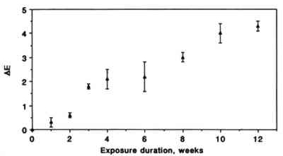
In this example from Williams et al. (1993) used \(\Delta E\) to show changes to watercolors exposed to sulfur dioxide.
Categorizing Color: Color Temperature

Unless we are using a mono-chromatic light source, all the light we use, both natural and artificial, is a mixture of different percentages of all the visible wavelengths. One way of describing different lights is by color temperature. This diagram shows how daylight at different times of the day can be expressed as color temperature (in ºKelvin).
Color Temperature Calculation

Color temperature is calculated mathematically. It describes an (imaginary) black body that absorbs all the radiation that falls on it—hence the term "black body".
As it is heated it starts to glow and change color. The color of the black body is directly related to its temperature.
Here is the CIE XYZ color space again showing how the color of the black body moves through the spectrum as its temperature rises.
Categorizing Color: Color Temperature Graph

The light emitted by the black body is not just a single wavelength but can be plotted as a curve.
The color temperature is taken from the maxima of the curve.
Color Temperature Examples

Here are some examples of color temperature. Don't confuse color temperature with "cool" and "hot" colors. Color temperature is calculated mathematically. Cool and hot colors are functions of individual perception.
Categorizing Color: Metamerism

Metamerism happens when two colors (paint samples, dyes, fills) look the same under one light source and totally different under another. One of the problems is that all lights have their own spectral distribution.
These are examples of the spectral distribution of two very common lighting systems. The diagrams show the amount of light emitted at each wavelength through the color spectrum.
Categorizing Color: Another Problem in Color Perception
The other problem is that the human eye has only three color receptors. The three different cones are each, individually, sensitive to the whole spectrum, but in different amounts.
The brain adds the signals from all three kinds of receptors together to produce color information. And the combination of the signals from the three receptors may make certain colors look the same under some lights but not others.
For more information, return to "Cones in the Retina".
Color Systems Quiz
Categorizing Color: Summary
In this section you learned that:
- The Munsell color system uses chroma, value, and hue to assign a numerical code to each color.
- The CIE XYZ and CIE L*a*b* systems take into account the relative sensitivity of the human eye to different colors.
- The color temperature of the light source affects the appearance of a color sample to the human eye.
- The phenomenon of metamerism complicates the effort of color matching using the human eye.
References
This article on color can be found at JAIC Online.
Credits
Researched and written by Sheila Fairbrass Siegler
Instructional Design by Cyrelle Gerson of Webucate Us
Project Management by Eric Pourchot
Special thanks to members of the Association of North American Graduate Programs in Conservation (ANAGPIC) and the AIC Board of Directors for reviewing these materials.
This project was conceived at a Directors Retreat organized by the Getty Conservation Institute and was developed with grant funding from the Getty Foundation.
Converted to HTML5 by Avery Bazemore, 2021
© 2008 Foundation for Advancement in Conservation