U.S. CUSTOM HOUSE, NEW YORK CITY: OVERVIEW OF ANALYSES AND INTERPRETATION OF ALTERED ARCHITECTURAL FINISHESCONSTANCE S. SILVER, FRANK G. MATERO, RICHARD C. WOLBERS, & JOEL C. SNODGRASS
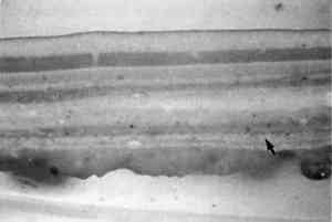
3 ANALYSES OF THE ORIGINAL POLYCHROMYThe inherent difficulties in determining the original colors and finishes of heavily damaged and overpainted architectural surfaces have been understood for many years (Johnston and Feller 1967; Miller and Phillips 1976; Johnston-Feller and Bailie 1982). The often unorthodox use of media and colorants, the use of inexpensive or poor-quality materials, blanching and fading from ultraviolet exposure, “bleed-through” of media from layers of overpaint and decades in darkness under overpaint, all contribute to darkening, yellowing, alterations of tone, and sometimes total mechanical failure of the finishes. To address these adverse conditions, a multistep process of examination, analysis, and synthesis is critical to the definition and interpretation of architectural finishes. Seven principal steps can generally be anticipated in order to determine, with a good degree of certainty, the original appearance of polychromy and finishes: (1) archival research that might provide information on the original design, aesthetic objectives, materials, and techniques of the finishes; (2) sampling and microscopical examination of full stratigraphies from every major element, followed by initial color matches to a standardized system, such as Munsell, or possibly chromometric quantification using spectrophotometry; (3) exposure of the original surfaces by mechanical or chemical means and initial matches to a standardized system; (4) qualitative and quantitative analyses of colorants and media to support identification of the intended color and gloss; (5) development of an initial palette based on these data; (6) probable adjustment of the colors of the initial palette; and (7) a mock-up (e.g., a model panel) of the final palette and finishes on a large wall area in situ under final lighting conditions. The process must be repeated for the glazes and scumbles. All seven steps were required in the U.S. Custom House. 3.1 RESULTS OF INITIAL ANALYSES OF ORIGINAL POLYCHROMYHundreds of mounted cross sections from throughout the building were examined using reflected light microscopy, despite the inherent difficulty posed by the very thin, friable, and discontinuous state of the degraded and overpainted original finishes (fig. 4).4 A consistent stratigraphy was evident: (1) the plaster support of the walls; (2) an assumed size on the plaster; (3) a buff-toned primer; (4) the base paints (restricted to five colors); and (5) at least 10 layers of overpaint.
The five base colors of Garnsey's palette initially were identified descriptively as mauve, apple green, cream yellow, light gray-green, and dark gray-green. However, when matched to Munsell colors and then made up as an initial palette, a distinctly “muddy” tonality was perceived in all five base colors. Alteration of the original base colors and known surface finishes, such as glazes, was posited, prompting additional research, examination, and analysis. 3.2 ARCHIVAL RESEARCHSeveral documents written by Garnsey provided insights into his technical expertise and highly developed aesthetic vision.5 In his proposal entitled “United States Custom House, New York City, Description of Decorative Painting,” dated May 5, 1911, Garnsey wrote:
Garnsey also described the ceilings of the elevator lobbies and the gallery:
In a letter of March 19, 1912, to Gilbert, Garnsey proposed the decoration of the main stairwells:
These documents indicate that Garnsey intended the architectural polychromy to chromatically reference the distinctive tones of the multicolored marbles and breccias used throughout the building. This hypothesis was confirmed in part when the unusual mauve and apple-green base tones were exposed on the wall panels of the gallery. They matched the mauve and apple-green base tones that had survived intact on the vaults of the main hall. These mauve Thus, it was posited that the predominant color used throughout the Custom House, initially identified as a “light gray-green” in cross sections and exposures, originally was a true “stone” gray that referenced the gray-toned marble wainscot used throughout the building—exactly as Garnsey had described. This hypothesis was supported when analyses of the colorants identified only lead white and a small amount of carbonaceous material, the constituents of a light gray. The surviving original ornament of the ceilings of the third-floor elevator lobbies were also executed in two shades of “cool” gray, providing further support. However, initial over-reliance on archival documents delayed recognition of the complexity of some of the finishes throughout the Custom House, especially those of the blue panels of the main hall and the blue groin vaults of the gallery. In 1990, visual examination of the blue panels, studies of cross sections, FTIR analysis, and analysis by fluorescent dye staining indicated a perplexing stratigraphy: (1) lead white preparation on the canvas; (2) pebble-textured blue base-paint composed of ultramarine and lead white paints; (3) application of one, perhaps two, tones of tinted glazes; and (4) a blanched protein-carbohydrate stratum overall.6 A 1915 description by Garnsey of a very similar decorative scheme in the library of the City Art Museum, St. Louis (now the St. Louis Art Museum) suggested the same materials and techniques of execution that characterize the decoration of the main hall of the U.S. Custom House (Garnsey 1915). Garnsey's 1915 description seemed especially applicable to the blue panels, in which the blanched stratum apparently was a pastelike material, intended to function as a matte-textured protective coating that could be removed easily with soap and water as it became soiled in urban environments. Garnsey wrote of his decorative finishes in St. Louis:
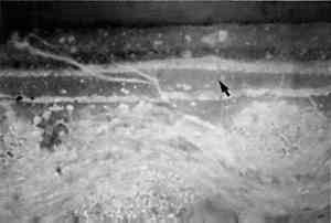
3.3 ADDITIONAL FLUORESCENT DYE STAINING AND FTIR ANALYSES OF SAMPLES FROM THE U.S. CUSTOM HOUSEFrom 1991 to 92, analysis and reanalysis of several samples of surviving original finishes and heavily overpainted finishes were conducted. Analysis of samples of the blue panels of the main hall indicated a technique of execution that differs from Garnsey's 1915 description of apparently similar finishes in St. Louis. In summary, the protein-carbohydrate material appears to have been worked into the blue base paint wet into wet rather than applied as a continuous surface coating. Thus, in a strictly sequential order, the toned glazes—composed of an oil medium and a resin medium—were the final application, but they were also worked wet into wet into the protein-carbohydrate material with a patterned tool (fig. 5).
Two researchers concluded independently that some finishes were executed as wet into wet multimedia composites, enhanced with tinted glazes in many areas.7 From these data, an intended marbleized effect was posited on some elements. Other finishes almost certainly were executed in emulsion paints, while others were standard oil paints. Analyses by fluorescent dye stains provided the following data: SAMPLE 1. Light gray-green paint, south stairwell. The entire layer stained positively for oil with rhodamine B (RHOB) uniformly; the bottom half reacted slightly with eosin isothiocyanate (EITC), a general protein stain. When stained with antimony pentachloride, the upper half did not react, while the lower half of the layer strongly reacted, indicating a resinous component in that portion of the film. This pattern of staining strongly indicates a phase separation on drying in the binding materials, such as an emulsion paint system. There was an unusual staining with antimony pentachloride on the surface of the layer, indicating a resinous component such as a varnish or glaze layer. SAMPLE 2. Mauve paint, wall panel, south stairwell. This paint stained positively for oil, carbohydrate, and protein (using RHOB, triphenyl tetrazolium chloride, and EITC) and must be considered an emulsion type of paint. SAMPLE 3. Dark gray-green paint, pilaster, south hall. The original surface appears to have presented a marbleized effect because there are three layers applied almost wet into wet. Layers 2 and 4 are colored the same and stain positively for oil and a resinous component, while layer 3, the actual dark gray-green, appeared to be only oil. SAMPLE 4. Mauve paint, rosette on pilaster, second floor. This paint stained positively only for oil. SAMPLE 5. Light gray-green paint, outer border, main stairwell. This paint stained for oil, carbohydrates, and trace amounts of proteins, indicating an emulsion. Slight staining with antimony pentachloride, observed near the surface, indicates a varnish or glaze. |