Inpainting/Overpainting Paper Art: Using Mixed Dry Pigments and Complementary Colors
by Christine SmithBackground
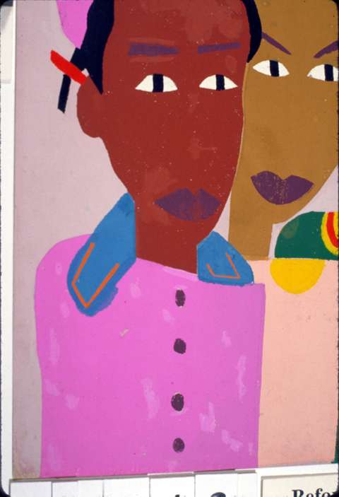
Fig. 1a Areas of inpaint on the dress of the girl at the left have changed dramatically. (Serigraph by William H. Johnson, mid-20th c. )
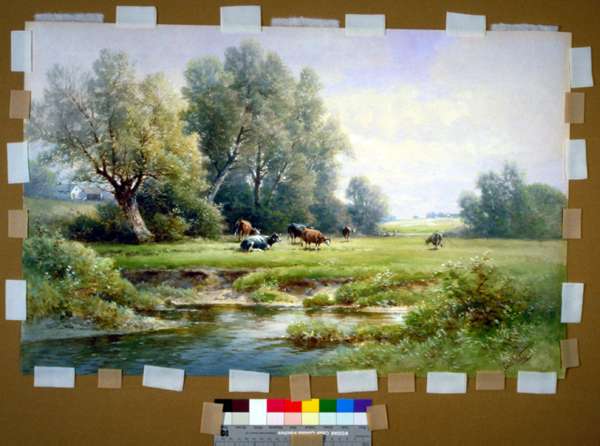
Fig. 1b Areas of inpaint have changed from the color of the sky. (Watercolor by Carl Weber, c. 1900)
Inpainting with watercolor paints is unacceptable in many situations, most frequently because the disfigurement is on the object itself, not a fill. A "barrier layer" of cellulose ether between the object surface and inpaint cannot provide certain protection against paint sinking into the cross-section of the sheet, and removal of watercolor inpainting, should that become desirable some time in the future, may pose risks to the artifact or be only partially successful. In addition, paints which look alike initially can be expected to age differently if they are made with different materials or with materials in different proportions: therefore, inpainting will need to be redone at some time in the future. (Fig. 1a,b) When that time arrives, dry pigments can be lifted almost completely by eraser.
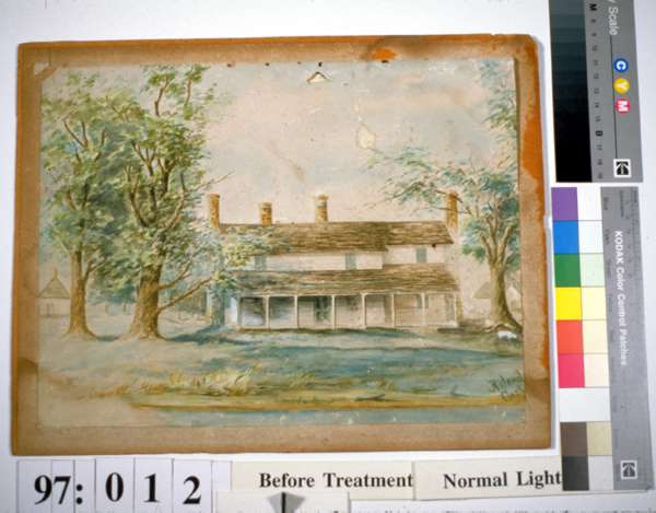
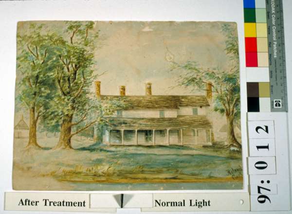
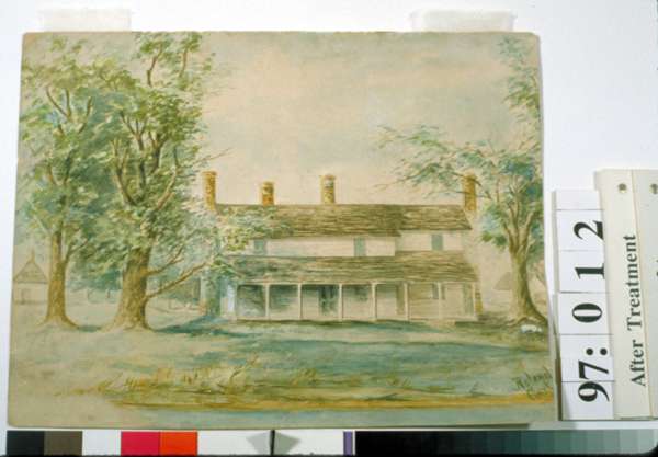
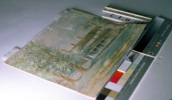
Fig. 2a-d A watercolor painting had been subjected to a variety of stains and damage over decades in an old summer home. It is shown before treatment, after washing, and in normal and raking light after overpainting with dry pigments. ("Lowland Cottage" by Roland Clark, c. 1900)
Sometimes overpainting the object itself would be the only way to achieve visual improvements such as decreasing the visibility of residual stains or stains which for various reasons are not to be treated by washing, bleaching, or solvents. In such situations, it may be appropriate to apply mixed dry pigments to the artifact itself. (Fig. 2 a-d) Similarly, tears which remain visible after mending can be disguised with dry pigments. (Fig. 3)
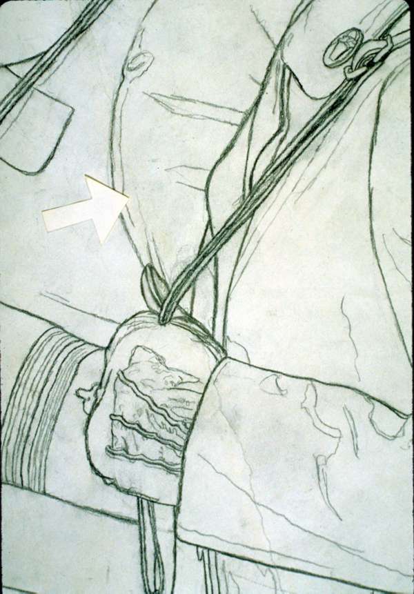
Fig. 3 A long tear line held severely embedded dirt. After removing the dirt as much as possible with a scalpel and mending the tear, dry pigment was applied. The area above the arrow has been toned, the area below it has not yet been overpainted. (Detail of a graphite illustration by Norman Rockwell, undated)
With paper artifacts, mixing inpainting/overpainting media to the same color as the area to be covered often produces unacceptable results due to the usually pervasive interaction of support and design media. In an unblemished area, both the texture and color of both the support and medium/media are seen simultaneously, so the eye/brain blends at least four qualities as it views the object. To disguise a stain or dark tear line on the object, we have to add into consideration the apparent color and texture of the discolored area. Moreover, some degree of transparency is often characteristic of the support, media, or both. Finding an inpainting/overpainting medium that will mimic the intricate, intimate relationships among the colors, textures, and transparency of support and media while covering a defect seems impossible, and many paper conservators have concluded that this color-matching dilemma and the porous nature of the objects forces an ethical practitioner to accept defects which remain visible after treatment by hand tools, water, solvents, or bleach. However, while historic artifacts are valued for their associations and archival artifacts for their information, art objects are valued for their appearance. Often, leaving visible defects is a less than satisfying option. To move beyond stabilization and return art objects as much as possible to the artists' visions, while avoiding damage from an irreversible technique, one might look for ways to trick the viewer into not seeing residual defects. Prototypes for such "optical erasure" of residual defects can be found in Impressionist and Pointillist painting techniques, which use tiny dots of different colors that combine in the eye of the viewer to produce an apparently completely different color.
Another suggestion for optical removal of residual defects can be found in well-chosen window mat colors, which minimize the visibility of discolorations on artifacts. Using a very dark brown mat on an object with tan stains can make the stains noticeably less visible than they would be in a light-colored mat. Three factors are involved: value (a point on the continuum between white and black), color (a certain hue, shaded or tinted), and saturation (the vividness of a color). With respect to color, the key lies with complementary and matching color relationships. (This discussion refers only to subtractive color effects.)
Depending on the color relationship between stains and support (e.g. grayish stains on cream color versus yellowish stains on cream), the intensity of the stains, and the extent to which they cover the support, the mat color can be chosen to lessen their visibility. For example, if the support, stains, and mat all share a similar color character while the mat is very dark, the stains will seem to recede because their value is much closer to the support than to the mat. A mat with similar color character but higher value (i.e. lighter) would make the stains appear, by contrast with the mat, darker. If the mat is a more saturated color than the stains, they will appear duller in comparison. If the mat is less saturated, the stains will appear brighter.
If the object were framed by a dark mat with color tones somewhat complementary to the stains (i.e. a dark brown mat with purplish or bluish character around yellowish stains on creamy paper), the value difference between stains and mat would help negate their visibility, but color contrasts between the stains and mat would emphasize their respective colors and defeat optical diminishment of the stains. Since tan is light brown, which is some combination of yellow, red, and black, purple would complement/emphasize a tan with predominantly yellow color while green would emphasize a red component. A pale/high value color would emphasize the black component in the tan stain. Therefore, the stains would probably be most visible in a pale, cool violet or green mat#8211;the exact mat color varying with the character of the tan stains.
If one frames an expanse of pure green in a band of pure red, the two exaggerate each other's qualities, making the red look redder and the green, greener. But if one puts tiny dots of green close to tiny dots of red over a white ground, the eye will mix the dots and see gray, as demonstrated by Pointillist paintings. Using these concepts the conservator can find colors which disguise or minimize blemishes by deemphasizing the offensive color. The conservator assesses the qualities that combine to make the blemish appear as it does, decides which value and color could negate those characteristics, and then lets her eye choose pigments to fulfill those criteria. Once the corrective color has been formulated, tiny dots of it are laid on the defect, merging in the viewer's eye with the color of the defect to produce an apparent third, corrected color.
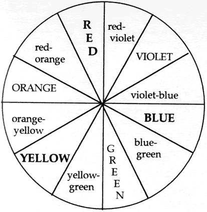
Fig. 4: Color Circle
For example, a cream-colored paper with a sparely drawn, highly soluble drawing is disfigured by a band of foxing around its margins. The foxing is darker than the paper, so to make the eye not see the foxing, the optical eraser needs to be very pale. But working with media teaches that stark whites usually have a distinct bluish cast, and the paper with which the inpaint must blend is yellowish. Therefore, the corrective color needs to be very pale while steering clear of bluish tones. Analyzing the reddish-brown color of the foxing and combining value and color criteria, the appropriate inpaint color would seem to be a very pale green of some sort. (The complement of foxing's red character is green. The brown component consists of red, yellow, and black, for which the complements are green, purple, white. To begin mixing the inpainting color, the conservator might choose a warm white to gain lightness with as little blue as possible. Adding a little yellow ochre might help to counter excessive blueness in the final color. A cool green might produce undesirable blueness, so a green with some yellow might be preferable. However, in combination with the ochre a yellow green might make the color mixture too bright. Adding a touch of violet would both dull the green while avoiding blue and complement the yellow component in the foxing.) After trying this initial mixture on the object, the conservator would make appropriate adjustments based on the particular colors involved. (Fig. 4)
The "negation effect" of complements can be used in two ways. Tiny dots of a complement over a surface can, in combination with the color showing between them, cancel an undesirable color. Or, a thin layer of the complement can be spread over the entire surface defect, so the color of the defect shows through the thin pigment layer to negate the undesirable color. Because only dry pigments are used, almost all this overpaint can be lifted by an eraser if appropriate at some future time. These techniques sometimes make damage disappear completely, sometimes only mitigate its visual obtrusion.
Benefits
- Inpainting/overpainting with mixed dry pigments is largely reversible with a kneaded eraser, in contrast to paint. It is not always fully reversible because some pigment may become embedded in the fiber matrix.
- The inpainting pigment will not bleed into paper fibers as paint
is prone to do if a barrier interlayer is inadequate.
Fig. 5a,b Before treatment an abrasion was embedded with dirt and balled-up fibers. It had been overpainted crudely. After cleaning, realigning, and sizing the fibers, the object surface was overpainted. ("Sick Girl", lithograph in colors by Edvard Munch, 1896)
Any pair of opposite hues are complements to each other. A specific color reflects the wavelengths which its complement absorbs.
Interactive color effects can be studied using packs of "Color-aid" papers, available in art stores, to complete the projects outlined in Josef Albers' book, The Interaction of Color.
- Inpainting/overpainting can be undertaken in areas where the use of paint is inappropriate. (Fig. 5a, b)
- Dry pigments allow overpainting to disguise stains, accretions, shadows of tear lines, or other defects which the conservator cannot or for some reason has not removed.


Limitations
- The texture of dry pigments is different from the surface character of the object. This is obvious only in raking light, but discernible in normal viewing light.
- In some cases, one's best efforts can only minimize, not "erase", defects.
- Pigments sitting high on the object surface can be dislodged: they may fall away or smear.
- Although using a dental "paper point" (a tortillon about the size of a sewing needle) and a head loupe allows one to place pigment fairly accurately, dry pigment cannot be placed as exactly as paint on a brush.
Typical Applications
- To disguise tear lines. Dry pigment can be used to disguise both grayish tones created by gaps along tear lines and shadows cast by the thickness of the paper. Similarly, dry pigment can be used to disguise embedded dirt. In areas with tears or surface loss, the corrective effect is due partly to changing the perceived color and partly to filling in irregularities that cast grayish shadows.
- To cover foxing, matburn, and other stains when stain removal
was only partially successful or not part of the treatment process.
(Fig. 6a, b)
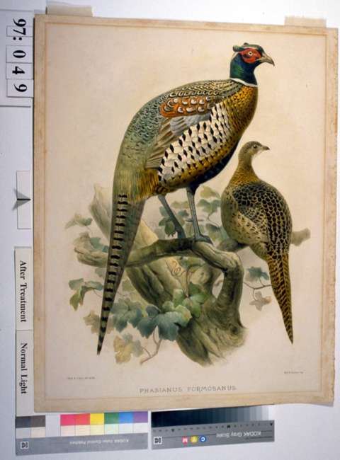
Fig. 6a, b No attempt was made to bleach the dark stains on this hand-colored and gum-varnished lithograph because sufficient rinsing would have been impossible. Instead, visibility of the stains was diminished by overpainting with dry pigments. This kind of treatment is among the least successful inpainting situations#8211;large areas of open, smooth-surfaced paper. ("Phasianus formosanus" M & N Hanhart after J Wolf & J Smith, late 19th c. )
- To disguise corrosion spots when chelation and dissolution of metal inclusions is not part of the treatment.
- To disguise pits in the paper surface. Mix a color lighter and more yellow than the paper itself. When applied in the pit, the color mixed with shadow will read correctly.

Technique
Inpainting should be done with the object positioned vertically so shadows cast by the texture of the artifact, which are bluish gray, are accounted for as the inpainting medium is formulated.
The object should be illuminated by light as close as possible to the kind by which it will be viewed.
Spread out as large an array of pastel sticks or dry pigment powders as possible, using materials tested for good light stability. Large boxes of pastels include what appear to be series of the same color in progressions from intense to pale versions. However, because tinting or shading sometimes makes a color look completely different, creating a visual "step" in a sequence may require a different pigment which, when mixed with white or black, looks as if it belongs to the series. As a result, some sticks in a color sequence may be more lightfast than others: the manufacturer's chart for that product line will reveal such discrepancies. The lightfastness of pastels is also influenced by tinting because, for most pigments, reducing pigment concentration increases susceptibility to fading. The colors in pencils are more likely to be fugitive than those in fine pastels or pigment powders.
Once the mind has decided what qualities are needed in the corrective color, the eye scans all the color possibilities, looking for components of that color. Because the goal is to trick the viewer's eye, color choices throughout the inpainting process are made on the basis of what the eye suggests.
Mix to optically subtract the offensive color. This is done by finding the corrective balance among the value and color of the defect, its background, and the desired appearance. Both the optically subtractive color and one or more of its components are likely to be surprisingly bold in relation to the color of the disfigurement. Because mixed colors are duller than their constituents, bright components are necessary to arrive at the correct final color. Furthermore, the corrective color will be seen next to or over a color that may be dull and dark so it will have to dominate those characteristics. If the defect is darker than surrounding artifact areas, think of adding lightness rather than whiteness. The bluish cast which white media impart is close to gray, which darkens. Generally it is more successful to mix the inpainting color using pale versions of complementary colors as much as possible and to use as little white as possible.
Use a scalpel blade to crush several potentially useful colors in individual piles on a white glass or ceramic surface. Then drag small amounts of one color to an open area on the work surface, and use the side of the scalpel blade to mix in and crush some particles from another pile. Using two to three pastel sticks, in some proportion, one should be able to achieve a satisfactory color. Very dark stains often require an underlayer of intermediate color to lessen the discoloration before the optically correct color can be applied.
To apply the pigment in pinpoint-size dots, use coarse grade dental "paper points" (available from dental supply houses).1 For greater coverage, small tortillons are useful. Keep them clean and sharp by frequent pointing on sandpaper, and wipe off abrasive particles before picking up pigment again.
Wearing a head loupe enables one to position the pigment dots exactly in all but a few instances.
Chaotic fiber arrangements in severely abraded areas make it difficult to place pigment precisely. Before inpainting, apply moderately viscous cellulose ether solution to the area, allow it to dry, and then compact the fibers using an interleaf and hand tool.
The sides and bottoms of deep, narrow splits can be difficult or impossible to reach. Along their edges, tiny yellow dots can counteract the darkness/blueness caused by shadows cast by the splits.
Apply tiny dots of the inpainting color over the underlaying discoloration, leaving small spaces around each dot. The eye will mix the two colors and optically erase the undesirable one. Applying the inpainting color over the entire defect is likely to reinstate the deficiency by calling attention to an obvious coat of color. (If defects are small and relatively far apart, the opacity of dry pigments is much less noticeable because treated areas are surrounded by expanses of untreated surface.) Therefore, the first dot should be placed over one of the darkest or most offensive points. Placing a little collection of dots around the first will make the worst area of the defect fade. When the most offensive area has been addressed, choose the second most offensive area and dot there.
If the applied color is too intense, lifting a little of it with a pointed kneaded eraser may be sufficient adjustment. Similarly, using a tiny "tortillon" of kneaded eraser to swipe lightly outward from an area of applied pigment can be useful in blending when there are large areas of stains over a sheet.
Work only about ten minutes and then do something entirely different for awhile. Otherwise, the eyes begin to discern innumerable nuances of color in the defect area, and color choices will be unduly influenced by these subtleties. The goal is to trick a viewer who comes to the artifact, looks at the defective area for a little while, and then looks at another area on the artifact. It is most efficient to walk up to the object pretending one is an innocent viewer and quickly decide which area is most offensive. Then quickly decide what would make it less obvious. Apply that color, go away for about ten minutes, return and quickly reassess. Make an adjustment and go away again. Working in short spurts, note which changes make the defect less obvious and try to analyze why, thinking in simple terms: "I still see the dark stain below, and it is casting a darkish, brown tone through my added colors" or "My blue is more green than the blue with which it should blend". Then turn away from the object, ask yourself what would resolve the defect, and as quickly as possible scan the pigment possibilities and working palette to see what is most likely to produce the needed change.
Pastel pencils may seem a quicker way to implement this technique, but they are not. Once one gains some experience mixing colors, it is much quicker and more successful to mix exactly the color one needs than to use the limited palette available from pencils. In addition, because pastel pencils are significantly harder than crushed pastels, pencils are more likely to dent soft papers. Finally, the colors in pencils are more likely to be fugitive.
There are occasions when white or black pencils alone are useful. In addition to different types of black pencils (charcoal, Cont, graphite) in a range of hardnesses and shades, a range of white pencils is useful. Like the blacks, some are more yellow, some more blue in character. Hardness designations on a sequence of pencils are not always reliable: some 2B pencils will be darker than some 4B pencils in the same product line. If working with pencils, try several before deciding which is best for a particular area.
Many disfigurements vary in color from one area to another, and they may be seen next to varying backgound colors. Therefore, adjustments in the inpainting color may be required from area to area over the object. Conversely, if there are large or numerous areas of the same stain on the same background, making very subtle changes in the color of the inpainting medium may make it less visible. For faded, blanched, or bleached areas, colors can be mixed to slightly enhance the lost color.
Making dry pigments adhere to slick surfaces can be accomplished by slightly moistening the pigment before picking it up. Press the moistened pigment into the artifact surface.
Over time, each conservator is likely to develop a personal color vocabulary and intuition to supplement theoretical information. For example, in my experience with this inpainting method, I think of bluish colors being negated by yellows, and purples by oranges although on a color circle purple and yellow are complements; and to my eye bluish/whitish colors tend to look "dry" while yellowish colors often look "wet". Therefore, I think in those terms when formulating an inpainting mixture while others may sense "warm"/"cool" color differences more strongly.
Precautions
As always, "Better is the enemy of good." When the defect is significantly less noticeable, stop working in that area. Overworking can produce a thick, clay-like accumulation with a burnished surface. Such a surface is prone to cracking, highlights the different textures in treated and untreated areas, and rejects further applications of dry pigment. Usually this problem can be avoided by trusting one's eye and working for only short periods.
Conclusion
Like other techniques for inpainting on paper, this method works best in areas where the object is highly patterned or modulated and least successfully in areas with large expanses of uniform color. It is not a panacea; but the advantages of nearly complete reversibility, the possibility of applying corrective media directly on the artifact, and the opportunity to significantly diminish visibility of otherwise untreatable disfigurements make inpainting with dry pigments a useful technique.
Terms
In this discussion, terms have been used as follows:
Color A general, imprecise term for what the normal human eye sees when light reflects off a paper or medium. When inpainting, it may be helpful to think of whites, blacks, and grays as colors.
Complementary color Color pairs that contrast with each other in the extreme: red and green, yellow and violet, blue and orange. A complement of a primary color is made by mixing the other two primaries, a complement of a secondary color is the primary color not used in the secondary color.
Hue A general term for a primary, secondary, or tertiary color, e.g. red, purple, reddish purple.
Inpaint Compensatory pigment, with or without binding agent, applied to fills and other areas not of the artifact.
Intermediate Color With reference to color theory, colors located between primary and secondary colors on the color circle. With reference to this inpainting technique, a transitional layer of corrective color.
Matching color My term for a color which emphasizes, rather than contrasts with, some characteristic of another color.
Overpaint Compensatory dry pigment applied to areas of the artifact.
Primary color The three colors from which all others are built#8211;red, blue, yellow.
Saturation The perceived intensity or vividness of a color, which increases as the amount of white or black in the color decreases.
Secondary color A color made by mixing two of the primary colors.
Shade A hue or mix of hues modified by the addition of some amount of black.
Tertiary color A hue made by mixing three colors. These colors may be dull or blackish.
Tint A hue or mix of hues modified by the addition of some amount of white.
Value A point on the contiuum from pure white to pure black, considering only the amounts of white and black involved, not color.
Notes
1. Thanks to Debora Mayer for bringing these to my attention.
Christine SmithConservation of Art on Paper, Inc.
Publication History
Received: Fall 1998
This paper was submitted independently by the author, and was not delivered at the Book and Paper specialty group session of the AIC Annual Meeting. It has not received peer-review