A Study of Visual Techniques for Identification of Watercolor Pigments
by M. J. DavisAbstract
A study of visual techniques for the identification of watercolor pigments was carried out at the Williamstown Art Conservation Center during the Fall of 1995. This paper is an overview of the collaborative project which was divided into three phases. Phase One: a visual study of watercolor pigments by students from Williams College. Phase Two: the results of my Getty Advanced research project involving the visual study of watercolor pigments in selected artworks, followed by positive identification of those pigments through scientific analysis. Phase Three: the implications both these studies had on a condition survey carried out concurrently by the Williamstown paper lab of 500 American watercolors and drawings owned by the Williams College Museum of Art.
Introduction

Fig. 1. Prendergast sketchbook from Williams College collection.
The college museum received an extensive collection of watercolors, paintings and sketch books by Maurice Prendergast (fig. 1) from his widow, with the specific mandate that portions of the collection be on exhibit at all times. It is this mandate which spurred the curators of the museum to have their collection surveyed, as well as, form exhibition guidelines to protect the artworks. In addition to the usual condition and treatment observations, the Williamstown conservators carrying out the survey sought to evaluate the effects of exhibition, and to assign each work a lightfastness category based on the present visual appearance of the media, the paper support and the artwork's collated exhibition history. Since decisions regarding the lightfastness and relative fading of various watercolor media would rely on visual observations by the conservators on-site, it was necessary to test the assumption that watercolor pigments could be accurately identified visually.
Phase I
The initial phase of the study was undertaken by five undergraduate students as a Winter Study course at Williams College taught by James Martin, Director of Analytical Services at the Williamstown Center. Their objective was to evaluate if pigments could be visually identified using tools which would be available during the on-site survey: visible and long-wave ultraviolet light, and infrared reflectography. The students began their project by listing watercolor pigments that were used between 1760 and 1950, the period inclusive of the artworks to be surveyed. These pigments (in combination with historical and chemical information) were used to create a searchable database.
From the more than one hundred pigments included in the database, fifty-five were selected for identification using a series of blind trials. These pigments were selected based on common usage in historic watercolors, low toxicity, and commercial availability in high-quality paint from Winsor-Newton. Three additional colors were prepared from dry pigments, gum arabic, and glycerin: Manganese blue, indigo, and Lac dye.

Fig. 2. Bands of watercolor washes brushed out on test sheet.
The selected colors were brushed in narrow bands (fig. 2) onto smooth and rough sheets of 100 percent rag watercolor paper. Each band represented a gradation of pure color, from opaque to a transparent wash. Each band was labeled by common name, Color Index name, and Color Index number. The students examined each color using visible and long-wave ultraviolet light, and infrared reflectography, then noted characteristic features.
Small portions of each band were cut out as chips, and randomly numbered. The students then attempted to match each color chip to the band from which it was cut. Many colors were misidentified. Reds, oranges, and yellows proved most difficult to successfully match. In some cases, fugitive pigments were confused with lightfast pigments. Among the possible reasons the students gave for confusion or uncertainty were the visual effects of pigment concentration (e.g., wash vs. opaque), and the color and texture of the paper support.

Fig. 3. Copy of Sargent watercolor with coded color chips used for identification.
In a final exercise, the students attempted to visually identify pigments (fig. 3) in an actual watercolor drawing. This exercise introduced two new variables in testing: the use of mixed colors, and application of overlapping colors. No consensus was reached on the identity of the pigments. The students concluded that visual techniques were not sufficiently reliable or accurate to correctly identify pigments in actual watercolors.
Phase II
The formation of my research project was an outgrowth of the Winter Study course carried out by the Williams college students. My goals: to assess the ability of a conservator or curator to accurately identify pigments based on visual examination of the paper and media using four actual watercolor drawings, and to positively identify the pigments on these four watercolors using analytical techniques.
The four watercolors most often requested for loan from the college museum's collection were chosen by the WCMA curators for this visual study. The watercolors were: Trees and Barns: Bermuda by Charles Demuth carried out in 1917, Low Tide, Nantasket by Maurice Prendergast, 1896-1897; as well as, Four Boys Bathing and Children on a Fence both painted by Winslow Homer in 1880 and 1874 respectively.
Visual Study And Research
Six conservators at the lab participated in the visual study, attempting to identify the pigments used by Homer, Demuth, and Prendergast. The parameters for the study simulated the conditions during a collections survey in which a conservator would spend a limited amount of time examining an artwork, when making general observations about condition.
The artworks mentioned above were placed on a table in the paintings lab. The conservators used only natural light for observation, but could reference the Winsor-Newton color chart or samples of faded pigments from a previous research project in carrying out their identification process. The participants responded in writing to questions regarding pigment identification and degree of fading. The four questions: 1/List the watercolors/palette the artist used for this drawing. 2/ The drawing appears to be faded? 3/ If yes, what observations helped you come to this conclusion? 4/ If no, what observations helped you come to this conclusion?
Following the visual study, I carried out pigment analysis on the four watercolors with the assistance of James Martin. The techniques used for analysis were polarized light microscopy (PLM), infrared microspectroscopy (IMS), and scanning electron microscopy with energy-dispersive X-Ray spectrometry (SEM-EDS). The analysis results were compared with the results compiled during the visual examination.
Children on a Fence by Winslow Homer
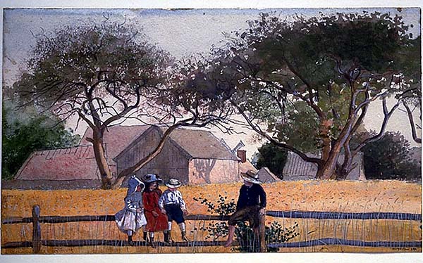
Fig. 4. "Children on a Fence" by Winslow Homer.
| Location | Pigment analyzed | # to ID correctly out of 6 people | Methods used for confirmation |
| lower lf. | Hooker's green | three people | PLM, IMS, SEM-EDS |
| girl's dress | Vermillion | one person | PLM, SEM-EDS |
| top margin | Indigo | none | PLM, IMS, SEM-EDS |
| boy's shorts | Prussian blue | three people | same as above |
| tree on right | Chrome green | none | same as above |
| foregd. | Chrome yellow | one person | same as above |
Question 1 on the survey asked the conservators to list the watercolors/palette the artist used for the drawing. Out of the reds (fig. 5) suggested (cadmium and vermilion), five conservators suggested the presence of cadmium red with one person choosing vermilion. Cadmium red was manufactured in the early 1900's to replace natural vermilion. However, vermilion tends to darken when exposed to light instead of fading making visual identification difficult (and aging predictions impossible) if misidentified. Analysis of a sample taken from the girl's red dress1 confirmed the presence of vermilion.

Fig. 6. Detail showing protected area of watercolor along the top margin.
The blue pigments proposed were cerulean, Prussian blue, cobalt, and ultramarine. Only three out of six participants suggested the presence of Prussian blue which was later analyzed and identified in the shorts of the little boy sitting on the fence. However, visual identification of the media in the blue sky [(fig. 6) which was sampled in the area previously protected by the window mat along the top margin] was unsuccessful. Analysis confirmed the presence of indigo, a very fugitive, organic pigment especially when used as a watercolor wash. None of the participants chose this color.
Six different green pigments were suggested by the conservators. Analysis of the tree in the upper left-hand corner was identified as chrome green (not listed by anyone) and Hooker's green from a sample taken in the lower left corner. Again, only three out of six people indicated a presence of this pigment.
Lastly, the yellow pigments chosen were raw sienna, ochre, cadmium yellow and chrome yellow. A sample taken in the foreground2 indicated the presence of chrome yellow. One participant suggested this pigment while five people felt ochre was the yellow pigment used by Homer.
Question 2 asked, "Does the drawing appear faded?" which resulted in the following observations. Two conservators indicated the watercolor appeared "slightly faded," and one person felt the overall uniform appearance of the pigments and the intensity of the thickly applied reds and dark blues was an indication the drawing was not faded. The remaining three conservators felt it was faded, because the protected margin showed the intensity of the pigments prior to overexposure to light.
Trees and Barns: Bermuda by Charles Demuth

Fig. 7. "Trees & Barns: Bermuda" by Charles Demuth.
The Demuth is the most requested watercolor from the Williams College collection. It hung for fifteen years in the sky-lite rotunda of the museum. We can assume that it was exposed to an average of 200 lux for approximately 10 hours per day, seven days a week. The artwork was removed from the rotunda in the early 1970's when the museum staff became aware of the irreversible damage caused by overexposure to light.
|
Location |
Pigment analyzed |
# to ID correctly out of 6 people |
Methods used for confirmation |
|
top center |
Vermillion |
none |
PLM |
|
top left |
Chrome yellow |
None |
PLM, IMS |
|
right side |
Hooker's green |
None |
same as above |
|
top margin |
Ultramarine blue |
two people |
same as above |
A combination of two factors made the visual identification of pigments used by the artist difficult for the conservators carrying out the study. First, the thinly applied washes had been altered by light damage. Vermillion3, (fig. 8) positively identified by analysis yet unidentified by the conservators, darkens when overexposed to light which makes identification difficult. Hooker's green4 (identified by analysis, but not by the conservators), a combination of chrome yellow and Prussian blue, is usually of intermediate lightfastness. However, the cumulative effects of light damage caused the areas of green pigment (trees in the upper right corner) to fade to a light, lime green. The second contributing factor making visual identification difficult was the tone of the paper substrate. As mentioned above, the margins of the paper (protected by a window mat from light) were a warmer, yellowish tone than the image area which appeared bleached. The whiter tone of the paper can affect the way the eye perceives the applied colors. Ultramarine blue5, considered a more durable pigment, was suggested by two people, then confirmed by IMS, and PLM.
In responding to the survey questions, four conservators wrote that the Demuth appeared faded, because "...the colors look too similar in value, the colors are not vibrant-- they appear dull, and there was a faint matburn around the margins with the paper much brighter where exposed to the light". The two conservators, who said the artwork was not faded, felt the intensity of the colors was similar and appropriate for watercolor washes. The yellowish tone of the paper protected under the window mat was noted, but the observer did not see any evidence of fading in the areas of strong color covered by the mat.
Four Boys Bathing by Winslow Homer
Fig. 9. "Four Boys Bathing" by Winslow Homer.
|
Location |
Pigment analyzed |
# to ID correctly out of 6 people |
Methods used for confirmation |
|
lower left |
Chrome yellow |
one person |
PLM, IMS |
|
left of center |
Prussian blue |
five people |
Same as above |
|
left of center |
(Prus.bl./chr.yel) |
two people |
Same as above |
|
hair (cen. boy) (Prus.bl/vermillion) |
none |
Same as above | |
|
upper right |
Red (Van Dyke br.) |
None |
Same as above |
|
top margin |
Prussian blue |
five people |
Same as above |
The watercolor Four Boys Bathing had a limited palette, and the conservators were more successful with pigment identification (fig. 10). Prussian blue was suggested by five people and it was positively identified with analysis. Out of the greens suggested, sap green, Windsor green, terre verte, chromium green, and Hooker's green, two people chose Hooker's which was sampled and identified just to the left of the center boy's head. However, the reddish area of sky in the upper right corner was analyzed as Van Dyke brown and it was suggested by no one.
Question 2 asking about the appearance of the drawing drew a mixed reaction from the survey team. One person said the drawing was faded, and felt the reddish purples appeared dull. Four people thought maybe the watercolor was slightly faded. One person wrote that no fading had occurred, because the colors were all the same intensity. Other comments: "...the blue seems dull" to "the pinkish red on the boys bodies appeared off color".
Low Tide, Nantasket by Maurice Prendergast

Fig. 11. "Low Tide, Nantasket" by Maurice Prendergast.
Analysis of seven pigments sampled from Low Tide, Nantasket are listed in chart form (fig. 12). The chart indicates a low identification by the conservators. The reds suggested included alizarin crimson (three people), cadmium red and rose madder (one person). Alizarin crimson, a good suggestion, was synthesized in 1868 to replace the more fugitive madder. Carmine, a more fugitive pigment when applied as a thin wash was identified with analysis and was suggested by no one. From the greens suggested, emerald green was identified with PLM detailing its characteristic rosette particles. However, visual identification of Prussian blue (two people out of four) was again the pigment identified by the most people.
|
Location |
Pigment* analyzed |
# to ID correctly out of 4 people |
Methods used for confirmation |
|
hat in bkgd. |
Barium chromate (Lemon yellow) |
None |
PLM, IMS |
|
rock mid-gd. |
Emerald green |
None |
Same as above |
|
boy's pants |
Prussian blue |
two people |
Same as above |
|
red dress fgd. |
Carmine |
none |
Same as above |
|
hat foregd. |
Gamboge w/ |
one person |
Same as above |
|
Prussian blue | |||
|
Red dress mid |
Rose madder |
one person |
Same as above + UV illumination |
*The pigments above are included in a "shopping list" in one of Prendergast's sketch books
The conservators unanimously agreed that Low Tide, Nantasket by Prendergast was faded. The reasons stated were: 1/ the overall appearance of the pigments, 2/ the figures in the foreground appear muddy, 3/ where brushed at full strength, only the deposits of undiluted pigment are still intense and 4/ the overall dullness and the sameness of tone in the pigments, and the near total loss of the palest pink.
In conclusion, the four watercolors discussed above presented the team of conservators with visual challenges. In very few instances did the visual observations match those obtained later with analysis. The results of my research indicate that visual characterizations are not an accurate means upon which to base color evaluation, yet many museums still rely on the visual memory of their curators and conservators as the basis for determining change in a sensitive artwork. Positive pigment identification can only be achieved with analytical testing. Since this procedure can be expensive, and involves sampling the media, analysis cannot be rationalized for an entire collection.
Phase III
The Williams College Museum of Art completed a condition survey of their Prendergast watercolor collection which was carried out by the Williamstown lab in 1991. In 1994, they obtained funds to continue surveying the paper collection and focused on 500 American watercolors, drawings, collages and prints ranging from 1760 to 1950. Due to the demands for in-house exhibition of this collection, Leslie Paisley, paper conservator at the lab, suggested the survey include recommendations which would help curators evaluate the light sensitivity of individual works in the collection and would assist them in developing guidelines for their future exhibitions.
During the initial planning session for the survey in the Fall of 1995, the paper lab decided on a methodology for the project modeled on work carried out by Karen Colby6 at the Montreal Museum of Fine Art in 1993. A new survey form would assign each drawing a light sensitivity rating. The drawing's rating would be based on the visual examination of its paper support, identification of sensitive media, and its collated exhibition history proved by the college museum.
|
ISO Level (blue wool) |
1 |
2 |
3 |
4 |
5 |
6 |
7 |
8 |
|
Mlx hrs to cause fade |
0.4 |
1.26 |
3.6 |
10 |
32 |
100 |
300 |
900 |
|
Feller's Categories |
CFugitive |
B. |
A | |||||
|
MMFA Categories |
1 |
2 |
3 | |||||
*Reprinted with verbal permission of the author.
The exposure categories chart7 from Colby's article was used as a model for determining light sensitive categories in the college museum's survey. An explanation of the chart (fig. 13) is as follows: Row 1, the correlation between the blue wool standards or ISO ratings. Row 2, the amount of light necessary to cause the first noticeable fade in megalux hours. Row 3, Robert Feller's lightfastness categories from previous research, and Row 4, the categories used by Colby in her exhibition policy, and subsequently used for the college survey.
In the Appendix of her article, Colby defined Category One, as all artworks with colors, media or support of lightfastness rating ISO 3 or lower. Her guidelines for Category One included all pastels, watercolors, gouaches and colored printing inks with any sensitive or unknown palettes. Selected specific pigments for Category One (gamboge, indigo in watercolor, safflower red, natural madder, and tumeric to name a few) helped to further qualify the light sensitive category.
During the actual survey, the artworks were examined using natural light (from windows normally covered by shades) in the print study room at the college museum. Observations regarding condition, prioritized treatment recommendations, and light sensitive categories were noted on a checklist form which allowed more time for observation.
Considerations During The Survey:
Comparison of thin vs. thickly applied washes. The same pigment may noticeably fade more rapidly where it was thinly applied in a transparent wash, but exist relatively unchanged where it was thickly applied. The source of the pigment. An artist whose palette either was unknown or suspected of containing inferior grade watercolors or dye-based pigments was conservatively categorized. The surveyed works were placed in the category which fit the most vulnerable element in their construction and this was noted on the inspection record. Reference to the collated exhibition history for each work. While this information was very useful when examining an individual work, accurate information such as the intensity and quality of light used during exhibition, the number of hours/day/week of exposure, the general environmental condition in the museum before the 1970's, and the conditions prior to the artwork's accession to the museum collection were speculative.
For example: The collated exhibition history for Homer's "Children on a Fence" is 142 weeks under museum conditions8 since its acquisition in 1941. However, the accumulated light exposure and exhibition environment were unknown for the watercolor prior to accession. Let's consider a worst case scenario [refer to (fig. 13)]: if the watercolor hung continually in a lit home environment prior to 1941, it may have received as much as 68 years of light exposure. Based on an average daily exposure of 200 lux for 8 hours per day for 7 days a week, the weekly exposure would equal 11,200 lux hours. 11,200 lux hours for 52 weeks a year would equal 582,400 (.58 megalux) lux hours per year or 39,603,200 (39.6 megalux) lux hours of exposure over 68 years.
Just noticeable fade to watercolor pigments in a sensitive category9 occurs with 1.2 megalux hours of exposure. With 39.6 megalux hours of exposure accumulated prior to accession in the collection, "Children on a Fence" is well past Category One, and into the Intermediate Category at Level 5. The above information in combination with the collated exhibition history for the artwork, supported the conservators decision in placing Homer's watercolor in Category One.
Additional techniques were suggested to the college museum curators to help with the dilemma of loaning or exhibiting sensitive works of art on paper. Visitor activated lights for an exhibition area would help with accumulated light exposure, replacing the original watercolor with a high-quality copy after 4 weeks of exhibition, and substituting another watercolor of similar interest would extend the life-span of the sensitive artwork. It was recommended that an exhibition policy with procedural guidelines be drawn up by the curatorial department to help safeguard the collection, to provide a starting point for discussion, and a policy for all departments of the museum to reference for guidance.
Conclusions
Determining the extent of change in a watercolor (faded or altered by light) by visual means alone proved impossible. However, discussions with the college museum curators regarding the future use and exhibition of such works were very productive and thought provoking. An example of the questions raised during the course of the survey included: What is the expected life-span of a work of art on paper? Without the answer to this question, it is impossible to indicate how many weeks of controlled exhibition per year will take the work to its endpoint. How long will the work last in exhibitable condition? Are category one watercolors that have experienced first-fade still an accurate representation of the artist's work?
Several museums were contacted about their exhibition guidelines for sensitive works of art. The standard guidelines were consistently three months every three years. However, curators of these collections admitted they were often pressured by their own or high-powered, borrowing institutions into placing sensitive works in exhibitions which would use up the exposure quota for a decade in a single show. It can be enormously difficult to enforce lengthy storage periods after the fact.
It is our hope that our research results, survey report and recommended guidelines will assist the college museum's curators in making decisions regarding exhibition and illumination by consciously determining the rate of change to their collection.
Acknowledgments
I would like to thank Nancy Matthews, the Prendergast curator at the Williams College Museum of Art for her cooperation and support for this research project. The Museum is to be commended for their current efforts in establishing an exhibition policy to safeguard their collection. My appreciation is extended to the Williams College students for their efforts, especially Claire Kelly who wrote the summary of their project presented in this paper. Special thanks to Leslie Paisley my supervisor during my time at Williamstown, and to James Martin for helping me with the scientific equipment and fielding my many questions.
Notes
1. Refer to (fig. 4). Red dress is worn by the center child in the group of three children on the fence.
2. Refer to (fig. 4). The yellow sample was taken from the grasses just above the fence post on the left side of the drawing.
3. Refer to (fig. 8). The sample was taken for identification from the vertical rectangle in the upper left quadrant.
4. Refer to (fig. 8). The Hooker's green was sampled from the upper right quadrant in the tree.
5. Refer to (fig. 8). The ultramarine blue sample was taken from the top margin in the upper left quadrant.
6. Colby, Karen. "A Suggested Exhibition Policy for Works of Art on Paper," J.IIC-CG, vol. 17, pages 3 - 11.
8. Exact light readings, temperature and humidity readings from the college museum were not recorded with the collated exhibition histories. However, the museum monitors its environment and restricts the amount of light used in an exhibition.
9. In referring to the exposure chart (fig. 13), Category One includes ISO levels 1, 2 and 3. Because all watercolors are not simply created with pigments from the same ISO level, level 2 at 1.2 megalux hours is chosen as a way to average out the effects of such a range of sensitivity and give a number to reference for discussion.
M.J. DavisPaper Conservator
Publication History
Received: Fall 1996
Paper delivered at the Book and Paper specialty group session, AIC 24th Annual Meeting, June 10-16, 1996, Norfolk Virginia.
Papers for the specialty group session are selected by committee, based on abstracts and there has been no further peer review. Papers are received by the compiler in the Fall following the meeting and the author is welcome to make revisions, minor or major.