Unearthing an 'Archeo': The On-Site Treatment of an Oversize Architectural Drawing and Some Notes on Its Fabrication
by Lois Olcott PriceI first examined this immense 8 x 10 foot architectural drawing entitled "Portico of Civita Castellana" by Harry Sternfeld, late in the spring of 1989 (fig. 1). At that time it was framed, glazed and bolted to the wall in the large sunlit front stairwell of the Furness building on the campus of the University of Pennsylvania. This building was and still is undergoing major renovations. It was a grey day, the curator from the Architectural Archives who had asked the Conservation Center to look at the drawing was unavailable, and the only light came through a large adjacent window. The frame and glazing were thick with dust and the site was covered with construction debris. I examined the drawing as best I could, and then persuaded a reluctant contractor to let me borrow his light for five minutes. Even seen under these conditions, it was a wonderful drawing, but as I prepared my preliminary proposal and estimate I had little hope that it would receive treatment.
It was therefore with a mixture of delight, hope and real trepidation that two colleagues from the Conservation Center, Susan Duhl and Jillian Jones, and I approached the treatment of this drawing the following September. There were some daunting constraints that would effect our treatment decisions:
- The drawing was still on the construction site hanging in the same place I had first seen it. Its structure within the frame and stability were unknown.
- It could not be treated at the Conservation Center because it would not fit through our doors.
- The space available for its treatment was a small newly constructed concrete block vault in an adjacent building. Its doors were too small to accomodate the framed drawing so it had to be unframed and stabilized as needed in the middle of the construction site before it could be moved.
- Finally, the drawing had to be treated and put in upright storage in this vault within 3-4 weeks after we began treatment because the space had already been committed to storage for other materials.
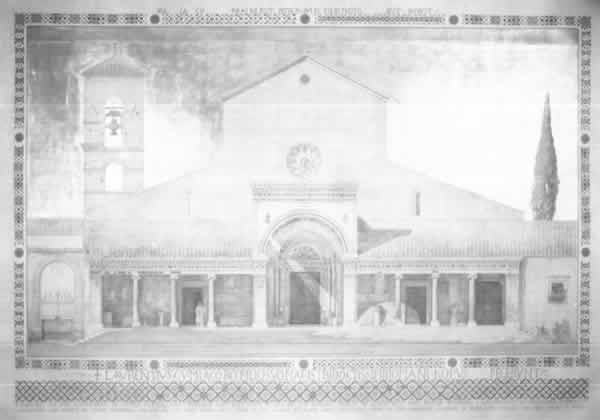
Fig. 1
The first challenge was to take the drawing down and move it. On the appointed morning a construction crew gathered, prepared scaffolding on which they could stand, unbolted the drawing from the wall and carried it down the stairs into a large adjacent room. It was extremely heavy and we held our breath as we watched six strong men reel under its weight. With the back visible, the structure became evident. The drawing was mounted overall on two sheets of heavy, dense laminated cardboard that were joined horizontally across the width of the drawing. The boards were supported by a weak and structurally inadequate wooden strainer to which they were attached with deteriorating adhesive and rusty nails pulling through the deteriorated cardboard. Mutual attachment to this flimsy strainer was the primary form of joining between the two halves of the cardboard mount. This was not a stable structure and moving it in its unframed condition was not going to be easy.
Before preparing to move it, I consolidated some flaking tempera paint in the decorative mat. We then wrapped the drawing in glassine, placed protective cardboard over the face and reinforced the unstable structure with a system of boards and clamps engineered by the construction foreman. Only then did we gingerly carry it to our treatment site.

Fig. 2.
Now, let me give you a formal introduction to this drawing (fig 2). The paper support is composed of one major sheet with small additions at the top and bottom and decorative margins joined at the top and side edges. The bottom addition to the drawing and the bottom margin are one sheet of paper. This bottom section of the drawing and the margins appear to have been added after the drawing was completed. The margin paper is slightly thinner and weaker than the paper on which the drawing was executed.

Fig. 3.
Two serious tears at the site of the horizontal join in the cardboard mount were probably caused by the movement and differential expansion and contraction of the paper and the mount (fig 3). The instability of the mount and the stress in the tear area indicated that these tears could easily extend themselves further into the design. This is the major factor that precipitated my reluctant decision to remove the drawing (all 9,500 square inches of it) from the mount although I knew that this procedure entailed the risk of further damage and other assorted complications. Fortunately, the paper was still relatively strong and flexible.
The drawing was covered with a heavy and disfiguring layer of surface dirt. It had suffered numerous scattered tears before it was mounted. There were water stains along the top left and bottom left margins and a small drip and stain in the bottom left design area. In addition, there were weak deteriorated areas in the bottom margin that appeared to have been damaged by mold. This moisture damage probably occurred due to condensation within the frame. The drawing had been framed directly against the glass, hung in the large front stairwell of a public building with no climate control, and was exposed to direct sunlight through an adjacent window—a perfect formula for this type of problem. Aside from general overall discoloration in the margins and other scattered stains, there was also evidence of insect damage particularly around the edges.
The metal leaf of the sky was laid down in slightly overlapping sheets with a resinous size. It is probably composed of a copper alloy known as Dutch metal that resembles gold leaf. A coating identified as shellac by its solubility and its ultraviolet fluorescence was brushed over the metal leaf, possibly to protect it from corrosion. This coating had discolored and deteriorated unevenly leaving brush strokes and drips more evident. The deterioration is most severe in the top left quadrant of the sky where the drawing was exposed to direct sunlight. In this area the shellac has contracted into small dark islands and the metal leaf has corroded severely. Tests revealed that this coating could not be safely removed or reduced.
Treatment was begun by surface cleaning the drawing using grated and solid gum and vinyl erasers, varying the method with the sensitivity of the area to be cleaned. We found that even in areas of watercolor washes we could clean more aggressively than anticipated. Cleaning removed most of the disfiguring surface dirt.
Then, using Teflon spatulas, the drawing was split away from the acidic and deteriorated cardboard mount. The spatulas were inserted an inch at a time and carefully moved along under the drawing to force a separation. Slight damage occurred in a few areas, particularly the weak and mold damaged bottom margin. The paper support was strong enough to allow us to roll the drawing back on itself as we worked toward the center. We used a large diameter tube or an extra pair of patient hands for additional support where necessary. Fortunately, the thick grainy flour adhesive appears to have protected the drawing from the worst effects of the poor quality mount.
After weak edges and serious tears were reinforced with temporary mends, we faced the task of turning the drawing over. We knew space was tight. After covering the face of the drawing with glassine, we clipped it with bulldog clips padded with blotters to sheets of reinforcing corrugated cardboard. Then, after several trials with a mock up and the help of several work study students from the Architectural Archives, we turned it over. We slipped it off the table leaving the mount behind, then propped the drawing against the adjacent wall. After removing the mount from the table, we lifted the drawing behind a protruding HVAC duct and maneuvered it up and back onto the table, reverse side up. I had planned the treatment so we only had to do this once more.
The reverse was covered with thick acidic paper residues from the mount and a grainy grey flour paste. We removed the paper residues by sanding with a small electric palm sander and with hand held sanding blocks; 220 grit sandpaper was the most useful for this job. Residues around the paper joins and the weakened edges were reduced mechanically with scalpels and microspatulas. This procedure also removed some of the adhesive layer, but no further efforts were made to remove it since it was causing no damage and the moisture used for its removal would have caused very problematic distortions.
All tears, original paper joins, thinned and insecure areas were mended with Japanese paper and wheat starch paste mixed with sodium carboxy methyl cellulose to reduce the tendency of the paste to cause distortion. Japanese paper hinges, 3-4" wide, were adhered in a continuous line along the top edge alternating grain direction and the amount of overlap to achieve maximum strength with minimal distortion. Hinges were placed along the sides and bottom at 3-4" intervals.

Fig. 4

Fig. 5

Fig. 6
Stains were reduced using a small portable suction disc of a sintered ceramic material marketed as a grinding wheel by the Norton Company, Industrial Ceramics Division, of Worcester, Massachusetts. The disc is secured in an aluminum funnel with a silicone adhesive and attached to a wet/dry vacuum. A disc of Whatman filter paper was placed on the surface of the disc which was held under the stained area while moisture and a dilute ammonia solution were applied to severely stained areas. The ultrasonic humidifier attached to a hose and pipette was used in conjunction with the suction disc to diffuse less severe stains particularly in design areas (figs. 4-6).
Small losses were filled with cellulose powder. These losses included small gaps along the two major horizontal tears and scattered losses in the bottom margin. To avoid planar distortions, these gaps were left rather than forcing the edges of sprung tears together. These fills were toned to match the surrounding area with pastel. Losses in the tempera mosaic design of the margins were inpainted with pastel in methyl cellulose. With treatment completed, we turned to the housing needs of the drawing. Fortunately, we had some help.

Fig. 7

Fig. 8
The mount was constructed by Jeff Kwait, an independent framer of great ingenuity. He first joined four acid-free hexel panels (Tycore) made by Archivart. By removing the top and bottom layers of board from the edge of one panel and the inner core from the edge of an adjacent panel, he created a tongue-in-groove join which he secured with Jade 403 and methyl cellulose mixed 1:1 (fig 7). To provide light weight strength and dimensional stability he secured the panel to a strainer of 1 x 4" extruded aluminum tubing with Telvar, a silicone adhesive obtained as a sample from a manufacturer. A more readily available adhesive with the same specifications is made by Dow Chemical and marketed as Aquarium Glue and Sealant. The aluminum frame was joined at each of the mitered corners by bolting both members to a block of wood inserted in the hollow cavity of the aluminum tubing (fig. 8). The horizontal and vertical cross braces of the strainer were joined to each other and to the outer members of the strainer with aluminum L brackets and screws. the edges of the Tycore panels were finished with 4-ply ragboard strips. The panel was everything we had asked for—rigid, light weight and, thus far, dimensionally stable.
After the panel was slipped under the drawing, hinges were wrapped directly around the edge of the panel at the top and secured with wheat starch on the ragboard edge and Jade 403 PVA emulsion on the aluminum strainer. The side and bottom hinges were folded back under the drawing and then forward again in a 1/2" accordion pleat before they were wrapped around the edge of the mount and secured. This pleated configuration will allow the drawing to expand and contract freely with changes in humidity.
Then, after briefly admiring the mounted drawing, we had to wrap it for storage. It will remain in storage until renovations are complete and it can be moved back into the Furness Building where it will be framed on sight and rehung in a location where it will receive less light.
As we treated the drawing a variety of architectural luminaries, some of them former Penn graduates, were brought in to see our work progress. They shared with us their memories of the drawing which had hung in the stairwell through generations of architectural students and of Harry Sternfeld who had been professor of design at Penn from 1924 until his retirement in 1959. As the days progressed I became increasingly curious about the drawing and the circumstances that had led to its production.
It's full legend reads, "Portico of the Cathedral in Civita Castellana. Designed and Executed in 1210 by the Cosmati Family of Architects and Mosaic Workers . . . Measured and Drawn by Harry Sternfeld Holder of the Paris Prize Given by the Society of Beaux Arts Architects in Rome 1921 Scale 3/4 inch equals One Foot" Using this and the information volunteered by my visitors as a starting point, I embarked on some modest research summarized below.
Harry Sternfeld, who painted himself in monk's garb on the portico of the cathedral (fig 9), had been a student of Paul Cret. Cret was a French born architect and teacher who became Dean of the School of Architecture at the University of Pennsylvania and the leading proponent of the Beaux Arts tradition. Although the Beaux Arts movement has been interpreted as a naive classical anachronism that was at its height during the years modern architecture was being invented, revisionist architectural historians have become increasingly aware of the very modern concerns regarding function and geometric composition that underlay the classical pediments, columns and capitals of this style of architecture.
The style drew its name from the Ecole des Beaux Arts in Paris where hundreds of young Americans had trained and whose program had inspired curricular reforms in most American architectural schools including the University of Pennsylvania. The students worked in groups called ateliers consisting of a patron (usually a practicing architect), ancien (older students), and nouveau, the less experienced students. Like ballet, the language of architecture became French as the student, working "en loge", literally in a cubicle, began by developing the "parti" or scheme, executed the "esquisse" or sketch, followed by plans done in "poché" and ended with the final "rendu" or rendering, usually done "en charette", meaning to meet a deadline.
The esquisse or sketch, was, in practical terms, the essence of the Beaux Arts system. A student was presented with a design problem and given, on average, 6-8 hours to produce an esquisse, a copy of which was collected at the deadline hour. The esquisse usually included plan, elevation and section. The student then had six weeks to develop final presentation drawings from his initial plans from which he was not allowed to deviate in any fundamental way. During these six weeks the student would receive several critiques from the anciens or patron depending upon his level in the atelier. There was also a good deal of give and take among those working on the same problem.
Up to this time, work was executed almost exclusively in pencil. By the 5th week the drawings would be blown up to full size, generally 2 x 3' to 3 x 4', and executed in reverse. This then allowed the drawings to be transferred by rubbing to the cold press Whatman paper invariably chosen as the support for the final drawing. After the drawing was transferred the lines were inked with a ruling pen, usually in various dilutions of Chinese ink which the students ground from sticks as they needed it. India ink was used for the major elements of the plan or pouché which were filled in with undiluted black. After the drawings were inked, the student began the rendering in watercolor, a process that, for an average drawing, took three days. At the deadline, time was called and projects were collected and critiqued
An important component of this educational system were the competitions sponsored by the Beaux Arts Institute of Design in New York. They held 6-8 national competitions a year. The projects were first judged at the local level and then the best were sent to New York. The most important single competition was that for the Paris Prize, the recipient of which went abroad to study at the Ecole des Beaux Arts for up to 3 years. It was an extremely prestigious prize for the student, his patron, and his atelier. The competition was held in three parts. The first preliminary competition was a 12 hour problem done "en loge" with no documents, references, critiques or outside assistance. The winners of this competition in each school progressed to the second preliminary competition, a grueling 24 hour problem (continuous) held under the same conditions. Five national winners were chosen from this competition. These five went to New York where they were given 12 hours to do an esquisse after which they returned home and had 11 weeks to develop the scheme using any criticism, help or resources they could muster. Usually the entire atelier participated and 12-14 hour days were the norm. The finalists then went to New York to execute the final drawings alone, taking with them full scale drawings, probably on tracing paper, ready to transfer to the final drawing paper by rubbing. Very large scale drawings with 6 to 10 feet dimensions were not uncommon.
This is the competition that Harry Sternfeld won in 1914 with a design for a city hail. His departure for Paris was delayed by the outbreak of World War I, but he finally left for Paris in 1919. After some time studying at the Ecole des Beaux Arts, he began to travel, sketching as he went and finally arrived in Rome where the American Academy at Rome had granted him a fellowship. While in Rome he pursued his personal interest in mosaics which brought him to undertake the drawing of the Cathedral of Civita Casteliana which was ornamented with the mosaic work of the Cosmati family. This category of drawing of an existing building or historical type of building is known as an archeo. The drawing in question is, in addition, a measured drawing, a specialty of the American Academy in Rome. Archeos and measured drawings were required exercises for architectural students because they helped them develop their architectural vocabulary. Sternfeld wrote the following account of his experience:
I had come upon this town only because of the importunings of an old monk who had observed me making full-size releves in color, in the cortile of San Giovani in Laterano. At first I had not taken seriously his report that the most exquisite Cosmati work was to be found in Civita Castellana—where he had spent his novicehood some seventy years previously. I yielded to him. I went, I saw, I was conquored! I had transported ladders and scaffolding by means of a special freight train—I had engaged local helpers—had tipped the sexton—had given alms to the local clergy—rewarded the local representative of the Ministry of Fine Arts—had satisfied the local workers' guild—and then with the aid of several friendly visiting Fellows, I had obtained the authentic measurements, and had made full-size replicas in color, on the spot of all the Mosaic Work.1

Fig. 9.

Fig. 10
After this work in the field, Sternfeld retuned to his studio in Rome where he executed this drawing.
In producing the Civita Castellana drawing, Sternfeld chose to do an elevation, probably in order to best depict the mosaics he had come to study. The metal/gold leaf in the sky is unusual and is probably a reference to the late Medieval/early Renaissance tempera paintings on panel from the twelfth and thirteenth centuries, an example of a student demonstrating his knowledge of the period. Otherwise, this is a typical though unusually large and extremely well executed archeo (fig 10).
This archeo, like the other student exercises and competition drawings discussed thus far, was done for its own sake as an end in itself; no building was built or ever meant to be built from these drawings. They are skillfully executed works of art and yet, they were judged by practicing architects who were concerned with the practical aspects of designing a functional building. In an interview shortly before his death in 1976, Sternfeld recalled his days as a student when architect William L. Price was on the jury. Price was so angered by a Sternfeld submission that he took a black crayon and drew a large X across the face of the drawing. It was common practice for juries to write their comments on the face of the drawing, but this was extreme. When a shaken Sternfeld asked Price why,
He told Sternfeld his objection was so great because he had demonstrated imagination and developed presentation skills which would undoubtably sell any building of his, which would be to the depracation of the profession since the project was so poorly planned.2
The educators of the period emphasize repeatedly that the parti was primary and the presentation secondary, but it is easy to see the danger inherent in such beautifully finished drawings. The execution of these school competition drawings did prepare graduates to enter the many competitions held for the design of major public buildings and monuments. These drawings were often large, highly finished, and imaginative in presentation as well as design. The presentation drawing was and still is a sales tool to woe the client or win the competition. In reaction, the modern school turned to stark black line drawings within the following decades.
The materials and techniques used for these drawings varied little. I will run through the whole progression briefly and refer you to manuals of the period which treat the process in great detail. First the paper was dampened and stretched on a drawing board or mount in the manner described for watercolor work in general. Whatmans cold press is the invariable recommendation for paper which seems to have been almost universally followed.
Once the support was prepared the full scale development drawing was transferred to it by rubbing (silver dollars and spoons being the most popular tools) or using ticking strips. Inking the drawing with a ruling pen and various dilutions of what is called Chinese, Japan, or India ink came next. The preparation of the ink was critical particularly if the rendering (wash work) was going to be done in ink to create a monotone. The ink was freshly ground from a stick, then filtered or strained to remove the larger particles. After the drawing was inked it was cleaned with a soft gum eraser to remove pencil lines, being careful not to disturb the paper surface, and then liberally sponged with water and allowed to dry. The shadows and any uninked details were then lightly pencilled in. Properly cast shadows were extremely important, especially in. Rendered geometrical elevations, where they indicate the form and depth of all projections.
Watercolor or monochromatic ink washes were then rendered over the inked lines. The renderer had to have anticipated the strength of his washes when he inked the drawing in order to insure his lines were of the appropriate tone to show through the washes. Recommended pigments for a minimal palette included ivory black, sepia, raw and burnt sienna, yellow ochre, Indian yellow, aureolin, cobalt blue, light red vermillion, alizarin crimson,' brown madder and Chinese white. While most sources included them in their list of pigments because of their wonderful transparency for shadows, they also warned students against the fugitive madder lakes. Undiluted black was seldom used except for the pouché and snap lines of the plan. Some pigments, particularly French blue, were chosen because they. Tended to settle in the texture of the paper approximating the texture of stone and giving a luminous, impressionist quality to the drawing. When uneven settlement was to be avoided, pigments were strained in the same manner as the ink or allowed to settle out in a saucer before use. Students were also warned against mixing more than two colors to avoid a muddy effect and streaks caused by pigments that varied insolubility and settling properties. In short, most advise for handling colors and graduating washes paralleled that given in comparable manuals for general watercolor work. When the drawing was complete it was, according to one oral history source, fixed to facilitate later cleaning. I have been unable to verify this in the published sources. Removing the finished drawing which had been stretched on a drawing board through all this was a somewhat hazardous process, particularly for large drawings, since the rendering sometimes ripped, as the edges were released and the stress relieved and transferred unevenly. Architects habitually patched the damage on the back and then inpainted the front.3
After the drawing was completed, particularly if it was to be sent to a competition, it was often mounted. Cardboard, paper and fabric mounts were all recommended in varying circumstances. Cardboards recommended include compoboard or Beaverboard which came in 4 x 12' sizes. Paper or fabric mounts had to be prepared by first stretching the dampened base material and glueing the edges to a strainer. Materials recommended include muslin and strong detail or brown wrapping paper. After the mount was prepared, the drawing was lightly moistened on the back and adhered to the mount at the corners or overall. After the drawing was mounted, a mat was applied. Four strips of paper were thoroughly dampened. One edge was pasted over the outer 1/2 inch of the drawing while the opposite edge was wrapped around the edge of the mount and pasted down. When dry both the mat and the drawing were "well stretched". The mat was sometimes decorated to varying degrees although the Sternfeld drawing is unusual in this respect.4
Fortunately, not all architectural drawings are this large or this structurally complex, but due to their scale and the poor storage that many have endured over the years, they present some unusual conservation challenges as well as real visual delights. I recently received a grant that will allow me to continue my study into the fabrication and treatment of American architectural drawings, and I am interested in hearing from anyone who has observations or suggestions to share.
Endnotes
1. Harry Sternfeld, "H.S.—Eleventh Paris Prize Scholar," N.A.I.E. Golden Jubilee Journal Commemorating 50th Paris Prize, 1964, p. 60.
2. Jeffrey Cohen, "Harry Sternfeld: Architect and Teacher," Typescript deposited at Athenaeum of Philadelphia, 1975, p. 11.
3. Interview with G. Holmes Perkins, Dean Emeritus, Graduate School of Fine Arts, University of Pennsylvania, October 19, 1989. Dean Perkins knew Sternfeld well and worked with him for many years.
4. Dave Shotwell, "The Mounting of Presentation Drawings," Pencil Point, 8:1 (Jan, 1927), 23-25.
References
Baker, Eugene B. "Competition for the Paris Prize". Pencil Points. 8:1 (Jan 1927), 45-46.
Cohen, Jeffrey. "Harry Sternfeld: Architect and Teacher." Typescript deposited in Athenaeum of Philadelphia, 1975.
Harbeson, John. "Harry Sternfeld: Student—Paris Prize Winner, 1914—Teacher." Pencil Points. 8:1 (Jan, 1927), 5-22.
Harbeson, John. The Study of Architectural Design. New York: Pencil Points Press, 1927.
Magonigle, H. VanBuren. Architectural Rendering in Wash. New York: Charles Scribner's Sons, 1921.
Shotwell, Dave. "The Mounting of Presentation Drawings." Pencil Points. 8:1 (Jan, 1927), 23-35.
Lois Olcott PriceSenior Conservator
Conservation Center for Art and Historic Artifacts
Publication History
Received: Fall 1990
Paper delivered at the Book and Paper specialty group session, AIC 18th Annual Meeting, May 29-June 3, 1990, Richmond, Virginia.
Papers for the specialty group session are selected by committee, based on abstracts and there has been no further peer review. Papers are received by the compiler in the Fall following the meeting and the author is welcome to make revisions, minor or major.